How To Make A Website Mobile Friendly
The post How To Make A Website Mobile Friendly appeared first on HostGator Blog.
Smartphones quickly went from expensive, exciting new technology, to a regular part of everyday life. Today we find it strange for anyone to leave the house without their phone. From hospital waiting rooms to theater lobbies (back when they were open anyways), people staring at their phones is a normal sight.
For website owners, that means it’s past time for your website to provide a good mobile experience.
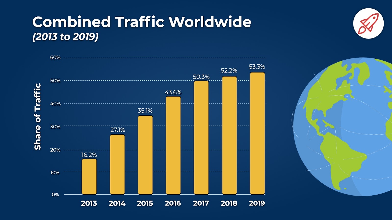
In 2016 for the first time, mobile internet usage surpassed computer usage. And the trend has only increased in the years since. Over half of all website traffic worldwide now happens on smartphones.

While the distribution of website traffic for individual websites will vary, approximately half of all your visitors are likely to be viewing your website on the small screen of a phone. Having a mobile-friendly website is no longer optional. If your mobile visitors don’t have a good experience on your site, you’ll drive away a huge portion of your traffic (and hurt your search engine rankings in the process).
You’ve heard it before by now, but we’re saying it again: your website needs to be mobile friendly.
Is My Website Already Mobile Friendly?
If your website was built or updated within the last few years, the designer or website builder you used may have had the mobile experience top of mind. Before you put a lot of resources into worrying about how to make your website mobile friendly, check to see how your website fares now.
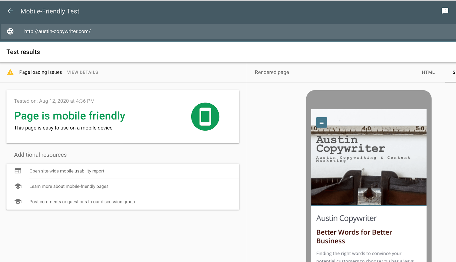
Google provides a mobile-friendly testing tool. Drop your URL into the search box. You’ll not only get a quick answer on whether or not your website is mobile friendly, but also a screenshot of how the page looks on a smartphone screen and a list of recommendations to make the mobile experience better.

If the tool shows that your website needs a lot of work, then making your website mobile friendly should be treated as a top priority. Doing so will improve your website’s visibility in the search engines, ensure more of your visitors stick around, and help you increase conversions on your website.
If Google’s tool gives you the thumbs up, updating your website for mobile doesn’t need to be given the same level of priority. But you may still benefit from considering ways to make the mobile experience better for your users. Every little bit helps.
12 Steps to Make Your Website Mobile-Friendly
Here are a few steps you can take now to make sure your website works as well for your mobile visitors as it does for your desktop users.
1. Make Your Website Responsive.
Most web design experts agree that building a responsive website is the best way to create a site that works well on both desktop and mobile platforms. That’s because a responsive website includes all the same content and information on any device you access it on, but the site responds to the device it’s being displayed on and optimizes its appearance accordingly.
In other words, the way a page is displayed and arranged changes based on the size of the device screen. An image that shows up next to a block of text on a desktop may show up on top of it when loaded on a smartphone, for instance.
With responsive design, you can make your website mobile friendly without limiting the information your mobile visitors can access – they still get all the same content the rest of your visitors do. And responsive design is also good for SEO. Google directly recommends it.
You may think you can’t build a responsive website on your own. But, as responsive design has become the norm, many tools now make it easy. Check out these 20 top web design tools for responsive web design.
Or go with the easiest option of all and use a website builder that offers responsive templates. All design templates in HostGator’s drag-and-drop website builder are already optimized for mobile. You don’t have to do anything special to make sure your website will work on a mobile device. Just select your template and you’re good to go.
2. Make Information People Look for Easier to Find.
People often pull out their smartphones looking for something specific—the answer to a question, the address of a nearby restaurant, or a customer service phone number. In these cases, they want to find the information they need as fast and as easily as possible.
Think about what information your mobile visitors are most likely to be looking for when they head to your website, and put that somewhere obvious and easy to find on the mobile homepage. Also consider the FAQs people most often look for when they visit your website. It might not make sense to put all the answers front and center on your mobile homepage, but make sure they’re easy to find and navigate to on a mobile device.
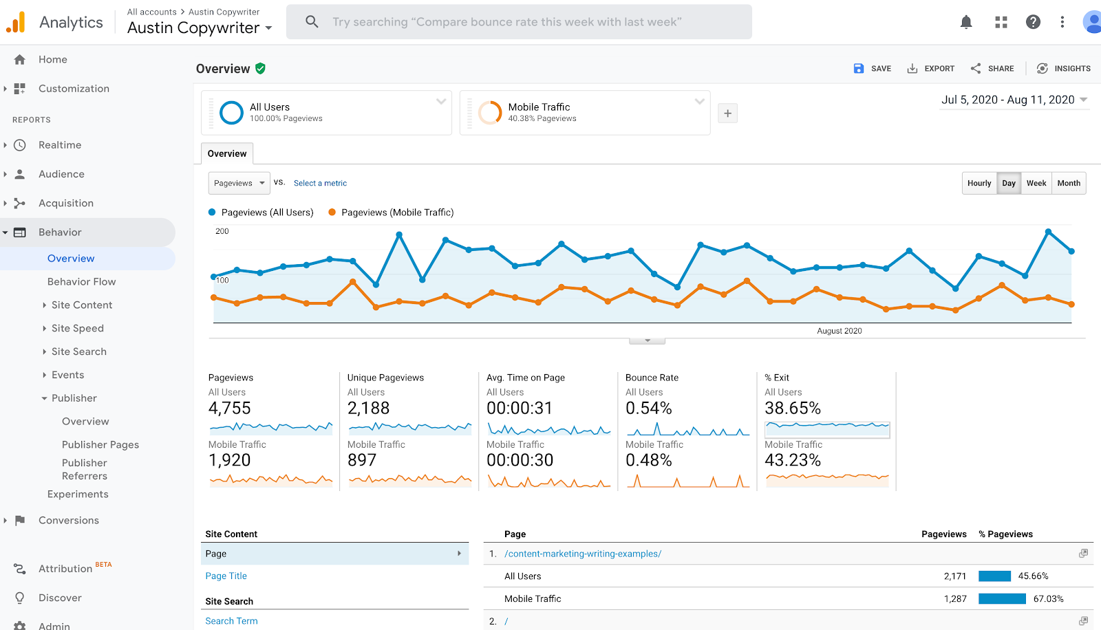
If you’re not sure what your mobile visitors are looking for when they come to your site, use your analytics. In Google Analytics, you can add Mobile Traffic as a Segment in the Behavior section, allowing you to see how mobile visitors interact with your website.

If you run a restaurant website and mobile visitors regularly perform a search for your menu, redesign your site to make it easier to find. If your visitors frequently visit the page with your contact information, maybe add that to the bottom of your home page. Reducing the steps they have to take to find the information they’re looking for will make their overall experience on your website better.
3. Ditch Text-Blocking Ads and Pop-ups.
Nobody likes them in any context, but when you’re trying to read text on a small screen and a big ad or pop-up blocks your view of the page, it’s extra annoying.
Most of your visitors won’t take the time to try and find the little X to minimize the pop up, they’ll just click away and go find another website. If you want to create a positive user experience, avoid allowing ads or pop-ups that block the content of a page at all.
If you feel they’re too important to ditch entirely, then at least either disable them for mobile users, or set it up so a pop-up only appears when they’ve scrolled to the bottom of the page, not when they’ve just landed on it. And make sure the X to cancel out the ad or pop-up is big enough that they can easily find and select it.
4. Make Website Speed a Priority.
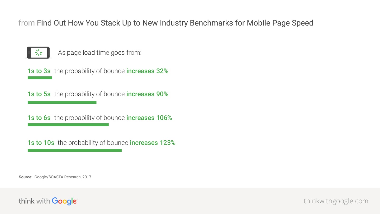
Maybe you remember the days of dial-up and having to wait impatiently for websites to load slowly. But now that everyone takes faster internet speeds for granted, if your website loads at the pace of the not-so-good old days, your audience won’t wait around.
Google’s research on mobile loading speeds found that most websites take over five seconds to fully load, but few visitors will wait that long before clicking away.

Website owners can deploy a number of tactics to improve site speed. Some top steps you can take to improve your speed on mobile are:
- Use AMP (Accelerated Mobile Pages) – AMP is a framework Google encourages for speeding up load times for your web pages on mobile. If you have a WordPress website, you can get started with the AMP plugin.
- Compress your images and CSS – The parts of a web page that load the slowest are those that are large and take up a lot of space, such as your high-resolution images and CSS. You can speed up website load time by compressing your image file sizes, so they load faster without negatively affecting the quality of what people see on the site.
- Check your web hosting plan – If your website has outgrown the web hosting plan you started with, or if you went with a less than reputable hosting provider to start, one negative consequence could be slower load times. You can speed things up by upgrading to a web hosting plan that matches your current needs.
5. Keep Your Web Design Simple.
Complicated websites with a lot of clutter are confusing on any screen, but they make it especially hard for visitors to navigate your site on a small screen.
Avoid clutter. Stick to a clean, minimalist design that makes it easy for people to find what they’re looking for. And by having fewer files on each page that need to load, a simple design will also contribute to faster load times.
Apply this thinking to your menu as well. If your website has a lot of pages and categories, it may make sense to offer a large menu on desktop screens. But on mobile, you want to cut it down to the most important options. Some websites switch to putting their menu behind a hamburger button on mobile. That way it’s not taking up much space on the mobile screen, but visitors can click to open it if they need it.
6. Make Your Button Sizes Large Enough to Work on Mobile.
It’s easy enough to click on a button of any size with a mouse, but when you’re trying to “click” with your fingers on a small smartphone screen, small buttons are hard to deal with. And that’s especially true if there are multiple small buttons close to each other—pressing one when trying to select another will cause real annoyance for your visitors.
The best way to save your visitors from this frustration is to use bigger buttons. And be thoughtful about where on the screen you place them. UX expert Josh Clark writes, “While a thumb can sweep most of the screen on all but the most oversized phones, only a third of the screen is truly effortless territory: at the bottom, on the side opposite the thumb.”
Any time you add a button to your site (and for all those already there), take some time to test them out yourself on however many mobile devices you can scrounge up amongst your employees and family. Make sure selecting each button is reasonably easy on all the devices and, if it’s not, update it so that it is.
7. Use Large Font Sizes.
Reading on a small screen is that much harder if the font is tiny. It’s best to use a font size of at least 14px on your webpages, but go ahead and test out how that looks to see if going bigger could be better here.
It’s also best to stick with standard fonts. Any font your visitor’s browser might need to download will slow down how long it takes your website to load, which is bad news on mobile.
8. Don’t Use Flash.
Using flash throughout your website is an SEO mistake. It can slow down a page’s load time and there are a lot of browsers and devices where it just doesn’t work at all. Neither Android nor iOS devices support flash, so if you build a website that depends in any way on the experience of a flash animation, your mobile users will be left out.
Most designers know by now not to use flash on a website, but if yours was built a few years ago, you may still have some lingering features that use the outdated technology. Scrap the technology altogether on your website and find a strong web design that works without it.
9. Include the Viewport Meta Tag.
The viewport meta tag is an easy way to control how your website shows up on mobile. If your page opens up as the same width on the small screen of your phone as it does on your desktop, you’ll have to awkwardly scroll from side to side to read each line of text and see the different sides of the page. The viewport meta tag tells browsers to fit the width of your page to the screen of the device type the visitor is coming from.
Adding this to your html is pretty simple. Just paste this onto the html for each page:
<meta name=”viewport” content=”width=device-width, initial-scale=1″>
10. Turn Off Autocorrect for Forms.
We all deal with the small annoyances of autocorrect all the time but even so, website owners often fail to think about the little ways autocorrect can make a user’s interaction with your website inconvenient.
If you have forms on your website that ask for name or address information, one small way to make providing that information easier on your mobile visitors is to turn off autocorrect for each form field, otherwise their phone will try changing their name or street name to more common words and slow down the process of filling out your form.
In the input field, make sure you include autocorrect=off in the html.
And if you haven’t already, make sure your forms are short. Don’t require visitors to provide more information than necessary. No matter what device they’re on, if the form takes too long to fill out or demands details a visitor doesn’t want to share, they won’t bother.
11. Allow a Way to Switch to Desktop View.
Some of your mobile visitors may actually prefer to see the desktop version of your website instead of the mobile one (especially if you go with a mobile version of your website rather than a responsive site).
Give them a way to do that if it’s their preference. You want your visitors to be able to interact with your website in the way that makes the most sense for them.
12. Regularly Perform Mobile Testing.
The best thing you can do to make sure your website offers a good mobile experience is to regularly test it out yourself on your mobile device. Every so often, pull up your website on your phone and tablet and spend some time browsing to see if anything’s hard to see or difficult to do. Ask your employees to do the same, and consider hiring users to do testing as well (since they’ll be seeing it all with fresh eyes).
Regular testing is the best way to catch small issues that create a worse experience for your visitors. The faster you notice them, the sooner you can update your website to provide a truly mobile-friendly experience.
Make Your Website Mobile Friendly
Even if you get everything right today, the way mobile devices look and work will continually change and today’s mobile-friendly website may not still do the job tomorrow. Keep testing, keep tweaking where needed, and continue to think about your mobile users as a priority and you should be fine.
Find the post on the HostGator Blog
Article Source : www.hostgator.com/blog/how-...