17 Great About Us Pages to Inspire You
Every business needs a website. And every website needs an About Us page.
Actually . . . take two steps back.
Let’s revise that.
Every website needs a unique and exciting About Us page that compels visitors to buy your product or service.
Stick with us, and we’ll look at what an About Us page is and why you need one. More importantly, we’ll discuss how to create compelling About Us pages that build trust, increase conversions, and boost retention rates.
After that? We’ll dip into 17 examples of unique and exciting About Us pages and delve into what it is about them that makes them worth a special mention.
We’ll Support Your Dream
Whatever your online goals, we’ll be right there with you, making sure your site is fast, secure, and always up. Plans start at $2.59/mo.

What Is an ‘About Us’ Page?
In short, it’s a page that serves to inspire people — either to work with you or to buy your product. It can contain (but isn’t limited to containing) your brand story, your achievements, and your best testimonials.
Related: Customer Testimonials and the Power of Social Proof
What Is an ‘About’ Page Not?
An About page is not a page for pushing a hard sell or a page for boasting about your business. It should offer an up-front and honest portrayal of your company, its story, and your brand values.
So when creating an About Us page, you should make sure to:
- Stay away from the hype. Users can see straight through it. Leave it for social media.
- Avoid a sales pitch. If a reader is on your About Us page, there’s a good chance they’re considering using your service or buying your product. They’re looking at why they should choose you. So don’t sell your product or service. Sell you.
Why?
It’s simple: People work with people, and people buy from people.
Tips For Making Great ‘About Us’ Pages
You should now have a decent idea of what an About Us page should and shouldn’t contain.
We’re going to follow this with a few tips to help you stand out and create an About Us page that works for you and your business.
- Be creative. Don’t fall into the trap of simply writing a brief summary of your business and calling it a day. The best About Us pages are creative, informative, and interesting.
- Don’t follow the crowd. If someone’s reading your About page, there’s a good chance they’ve been reading (or will read) your competitors’ About Us pages. So, make sure your page stands out. It should make it almost impossible for a potential customer to forget you.
- Feature faces. Consumers like to know who they’re buying from or working with, so make sure to feature at least some of your team on your About page. It can really help boost conversions.
Oh, and never use stock photography. Ever.
- Be transparent. Your About Us page serves to sell your story and get buy-in from your visitors. Transparency is incredibly important to win your visitors’ trust.
- Don’t forget about CTAs. Like any other page, About Us pages need calls to action. Many sites seem to forget that this is a key page for converting visitors. Make it clear to readers what you want them to do next.
Related: 7 Tips for Writing Winning Calls to Action for Your Website
How To Make An ‘About Us’ Page That Converts
1. Keep your copy simple.
Don’t litter the page with industry jargon and confusing copy. The words should leap off the page and inspire your visitors to take action. A block of text that visitors have to read six times to grasp is not going to cut the mustard.
2. Make sure your contact details are on the page.
This might seem obvious. However, we dug through countless About Us pages while researching this article, and you’d be surprised at how many we came across that didn’t contain contact details or even a contact form.
If a visitor’s got as far as looking at your About Us page, there’s a good chance they’re thinking of working with you or using your service. Don’t miss that opportunity to convert them by making them search for a separate contact page.
3. Put yourself in the readers’ shoes.
What do you think they are looking for? What do they need to know? Many About Us pages don’t seem to have considered these things. At all.
Does your page highlight your skills? Your knowledge? Your experience? Does it explain to readers the benefits of using your service or products? Does it reference your USPs?
4. Don’t be afraid to use visuals.
Consumers today are used to things being delivered fast. Whether it’s a product they’ve ordered or, in this case, information.
Are you able to sell your service or business in visuals and words? The human brain processes images much faster than words, so if you can, use both.
5. Include customer testimonials.
Trust in your brand is essential. Testimonials from genuine customers are a massive selling point and can help convert prospective clients into actual, revenue-generating customers.
Fancy going one step further?
Alongside customer testimonials, include quotes or endorsements from influencers or industry experts (if you can get them, of course).
6. Tell a story.
Tell your company’s history, but in a way that compels visitors to keep reading. Who doesn’t love a good story? Stories get visitors more invested in your brand. And that, naturally, leads to more conversions.
Bonus points if you can craft a more personal story.
7. Make sure the page loads fast.
This, of course, goes for every page on your site, but it’s crucial that key conversion pages load as fast as possible. Make sure to talk to your web developer and emphasize the importance of page load speed.
You can find out exactly how long a particular page of your site takes to load and what can be done to make it load faster with Google’s PageSpeed Insights.
Related: 12 Reasons Why Your Website Is Slow and How to Fix Them
8. Don’t forget the fold.
Ideally, all important information should be positioned above the fold. You should also guide users to scroll down and read more.
9. And mobile usability.
While it varies from industry to industry, more than half of internet browsing now takes place on mobile devices. So make sure your About Us page, and your site as a whole, is built for mobile first.
You can check if a page is mobile-friendly using Google’s Mobile-Friendly test.
17 ‘About Us’ Pages That Get It Right — And Why
Are you in need of some inspiration to help you build your ideal About Us page? Look no further. We’ve scoured the Internet to find some of the best About Us pages out there.
No matter your niche or what kind of business you run, you’ll be able to find some inspiration in these 17 examples.
Let’s take a look at each one and discover what makes these pages so unique and exciting (and worthy of inclusion on this list).
1. HERoines Inc.
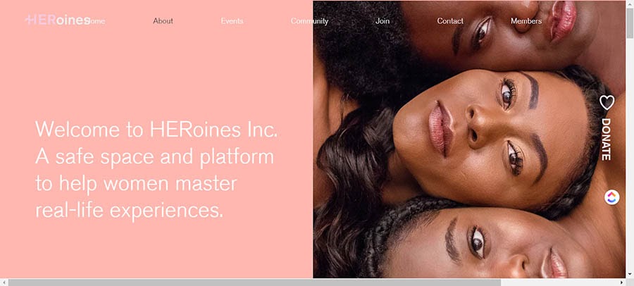
What makes this a good About Us page?
- The page itself is simple and aesthetically pleasing, and it loads fast.
- It features photos of the team that seamlessly fit into the page design.
- The colors and tones used match the rest of the site, creating consistency across all pages.
- It covers the brand’s visions and goals using inspirational, engaging copywriting.
- The CTA button sits to the right of the page and remains visible at all times.
2. Iconiq Creative
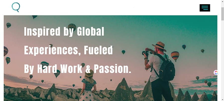
What makes this a good About Us page?
- It’s free of unnecessary words and gets straight to the point.
- It features case studies, a client list, and their credentials — all in plain sight, for all to see.
- They feature multiple testimonials (although this could be improved by slowing down the carousel or giving users the ability to scroll at their own speed).
- They’ve linked to their founder’s website, so visitors can learn even more about the brand and its history.
- It showcases their humanitarian work in a “Giving & Causes” section.
3. RubyLove
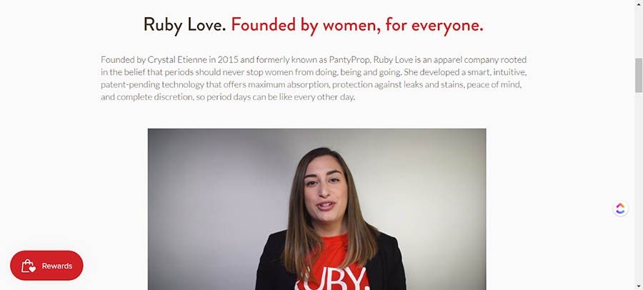
What makes this a good About Us page?
- The copy is upfront, accessible, and fun — despite the brand selling products that (sadly) still have some stigma attached to them.
- It sets out their mission from the first sentence.
- It’s not always a wise idea to sell on your About Us page; however, this site succeeds by soft-selling using videos, great imagery, and natural internal linking.
- It features a section that boldly states the benefits of their products and how they can help you. In other words, the copy is user-centric.
4. Band
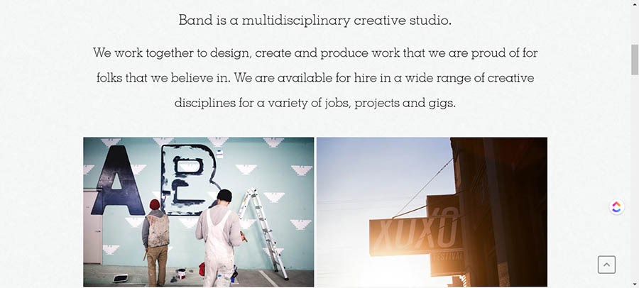
What makes this a good About Us page?
- As a creative studio, this About Us page demonstrates that knowing your user is crucial. The page kicks off with some fantastic imagery that reinforces their business mission.
- The copy is minimal but covers what’s needed: who they are, why they exist, and why you should work with them.
5. Anton & Irene

What makes this a good About Us page?
- This is one of the best one-page websites we found. Anton and Irene have effectively turned their entire site into an About Us page. It’s edgy and daring and, well, pretty unforgettable.
- The photography for the team (just the two of them) is incredibly creative. When you hover over their figures, snippets of what’s beneath the veneers are revealed. This one definitely isn’t following the crowd. Exactly what a design brand needs.
- It tells you who they are and what they do using one sentence and a few bullet points. In other words, it’s minimalist and to the point, while letting the user know exactly how Anton and Irene can help them.
- It features where they’ve appeared and what they’ve achieved, and it breaks it down into fun sections using hard facts (with a side of cheeky humor).
- Their contact information is some of the most detailed on this list, but it doesn’t feel tedious or over-the-top. It has that human touch. Largely because they’ve injected their personality into the entire page.
- They top it off by featuring testimonials and highlighting the awards they’ve won — and they manage this without sounding like they’re giving you a sales pitch.
6. LessFilms
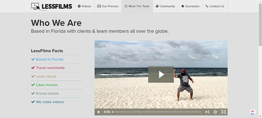
What makes this a good About Us page?
- They understand their target audience. As a video production company, they (understandably) use video to tell their brand story, and they do it in less than a minute.
- Everything else is kept to a minimum — they inject a little humor using bullet points that articulate who they are in less than 20 words. To top it off, they have a team member section that makes you feel like you know them personally. The page makes it almost impossible not to want to work with them.
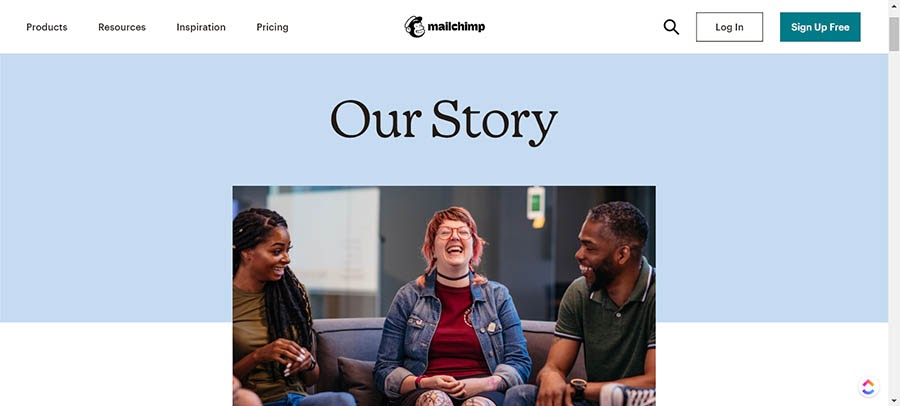
7. Mailchimp
What makes this a good About Us page?
- Despite being a big company, Mailchimp successfully manages to circumvent any corporate tropes. Instead, their About Us page makes you feel like you’re going to be working with a small team.
- Each section is only a couple of paragraphs long. Despite having a ton to talk about, Mailchimp understands that the reader only needs top-level ideas (though you can go off and learn more, thanks to dedicated pages for the company’s culture and history).
- At no point does the page feel like a sales pitch. It simply pulls you into what Mailchimp stands for and who they are as a company.
8. 500px
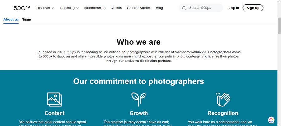
What makes this a good About Us page?
- As an online network for photographers, you would expect great visuals on their About page, and it doesn’t disappoint — especially if you happen to be a dog person!
- The page goes on to explain who they are and their commitment to their network. Plus, it’s completely free of fluff.
- It sets out the benefits of joining the network, and it does it clearly and concisely.
9. GIPHY
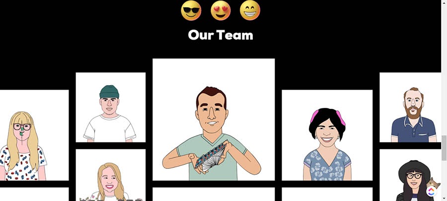
What makes this a good About Us page?
- If you’ve ever used a Graphics Interchange Format file (aka a GIF), then you’re probably aware of GIPHY. GIFs are fun. So GIPHY should be too. And they certainly haven’t let us down. They’ve seemingly taken their ethos, worked from the ground up, and created an About Us page that’s quirky, engaging, and completely on point when it comes to reflecting the brand and its identity.
- And it’s pretty much done entirely using — you guessed it — GIFs.
10. Twitter
What makes this a good About Us page?
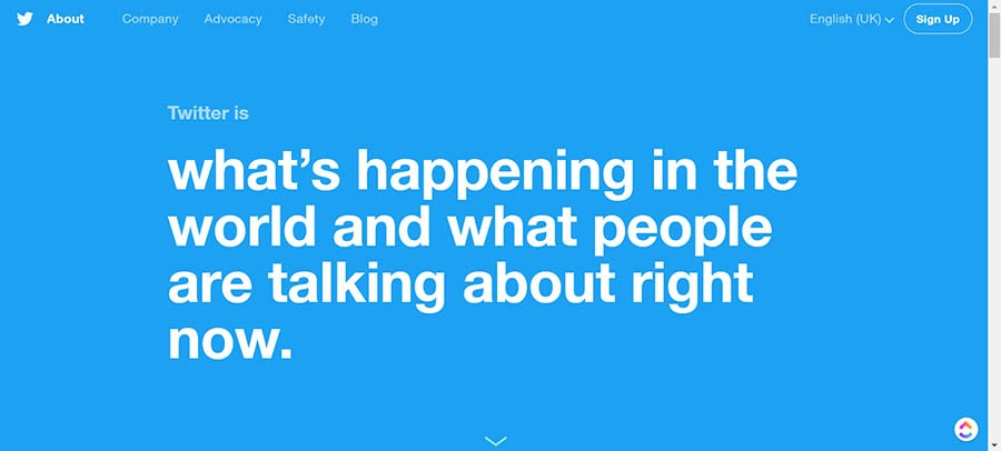
- Twitter’s About page hits the nail on the head when it comes to copy with brevity. It lays out who they are and what they stand for without going into too much detail. You know precisely what you’re going to get from the social network just by looking at their About Us page.
- It does an excellent job of moving visitors down the funnel and getting them to sign up and start using the site. They do this in part by pulling trending content into the page. This gives readers a CTA to try the platform.
11. Moz
What makes this a good About Us page?
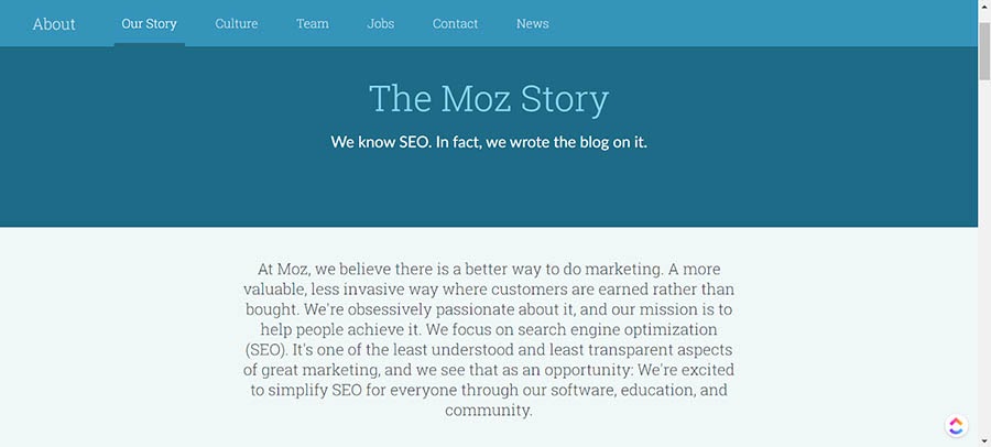
- Moz is known for its transparency, and this shines through in their About Us page. It’s honest, to the point, and tells you their entire story — but without dragging on or going into unnecessary detail.
- The page also acknowledges their faults and when and why that had to pivot their products to survive in their niche. This is pretty unique and impressive. Not all companies are so honest.
Related: How to Write a Blog Post — A Step-By-Step Guide
12. Cupcakes and Cashmere
What makes this a good About Us page?
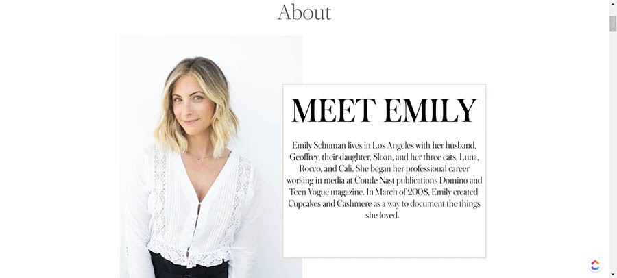
- While Emily’s adopted a more traditional approach, this About Us page clearly conveys who Cupcakes and Cashmere are and what they do.
- They do this using a set of strong visuals that show there are real people behind the brand with a legitimate mission.
- The site also includes a comprehensive FAQ section where pretty much every question a reader could have is answered — right down to how their affiliate links work.
13. Eight Hour Day
What makes this a good About Us page?
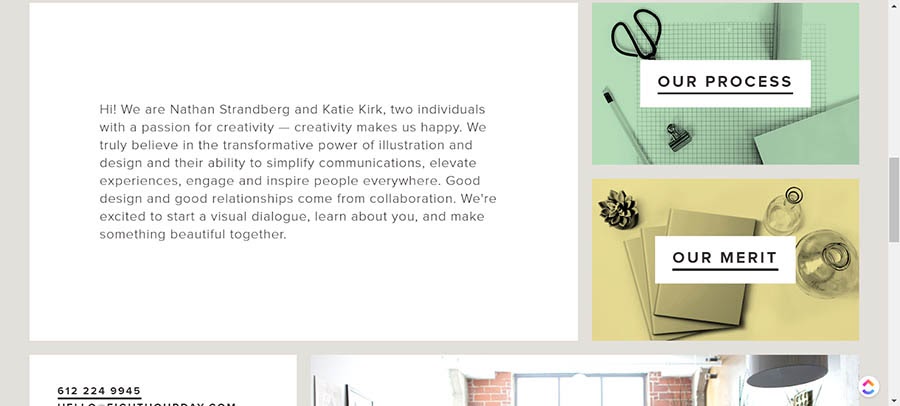
- This is another creative studio that successfully reflects the quality of their work with a simple About Us page that doesn’t beat around the bush.
- They tell you who they are, what they do and why they do it, and who they’ve worked with.
- And they do it all on one page, using clear, concise, and engaging copy.
14. National Geographic
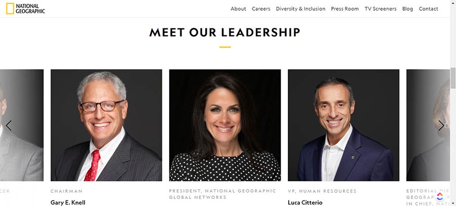
What makes this a good About Us page?
- Creating a more corporate About Us page that doesn’t feel stuffy and stagnant isn’t easy, but National Geographic manages to pull it off. The page begins with an inspiring video that’s right on-brand.
- The page then discusses their mission, alongside information about their leadership team. It also features a job board.
- Finally, they point you towards some of their most recent content — essentially a fairly subtle CTA.
15. Cultivated Wit
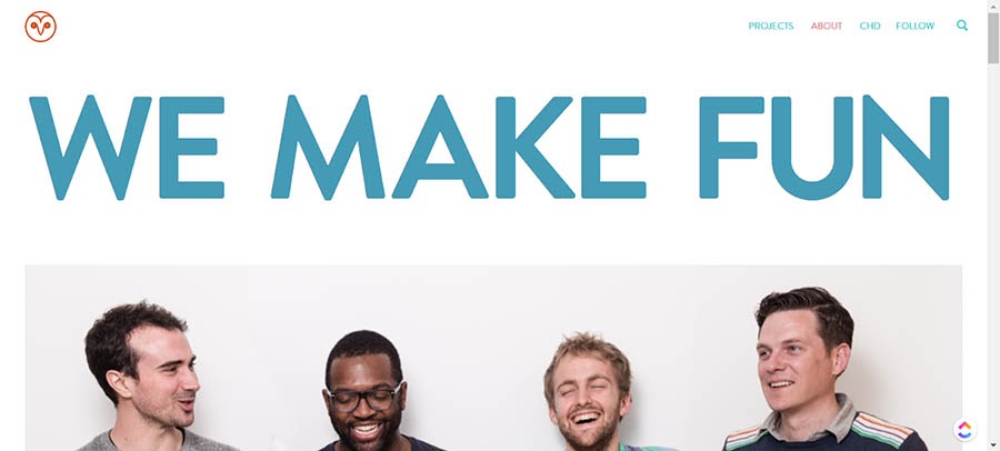
What makes this a good About Us page?
- As a comedy company, you’d expect their About Us page to be on the playful side. Cultivated Wit hasn’t let their visitors down. They’ve delivered engaging copy that articulates their mission statement in just a few hundred words.
- Cultivated Wit also uses well-chosen team imagery that makes it crystal clear who they are and how they work.
16. Lonely Planet
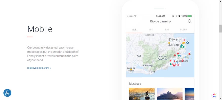
What makes this a good About Us page?
- If you’re reading the About Us page on Lonely Planet, you probably already know what they do — and Lonely Planet gets this. So, instead of preaching to the choir, the focus is on how their site can help the user.
- This page demonstrates the importance of design when it comes to an About Us page using stunning visuals and incredible design. Every part oozes class.
17. GummiSig
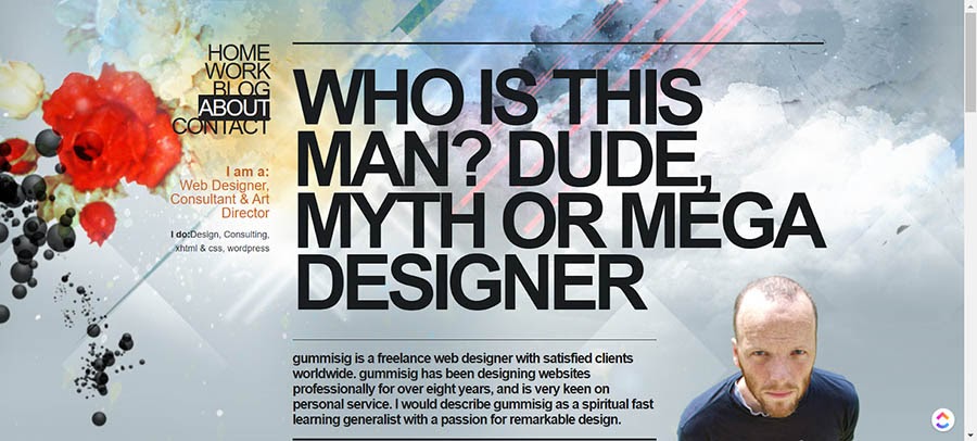
What makes this a good About Us page?
- Gummisig is a freelance web designer, so we’d hope they’d know how to put a good About page together. Thankfully, this one doesn’t disappoint. From the start, you know you’re on a quality page when you see the text, “Who is this man? Dude, myth or mega designer.”
- Gummisig also shows how important it is to inject your personality into your About page. The copy reflects this perfectly, so readers can get a real feel for who they’ll be working with.
Ready to Create a Stellar About Us Page?
Whether you need help writing a mission statement, creating a marketing strategy, or boosting your conversion rate, we can help! Subscribe to our monthly digest so you never miss an article.

So, What’s Your Value Proposition?
As you might have noticed, there’s no one set way to design an effective About Us page. Pages can be casual or corporate. Silly or serious. Image-led or copy-led. Or both.
Throughout all these pages, the running theme is that they engage, educate, and entice readers to become customers. They’re also an accurate reflection of the brands, and leave users feeling that little bit closer to the company — as well as the people behind it.
Create an About Us page that ticks these boxes, and you may well find you’re converting more customers (and better quality customers) with minimal extra effort.
Good luck, and more importantly, have fun!
The post 17 Great About Us Pages to Inspire You appeared first on Website Guides, Tips & Knowledge.
Article Source : www.dreamhost.com/blog/how-...
