Struggles of A Stylist: Emily Helps Stylist Lea Johnson With Her Open Concept Living And Dining Room Design Agony
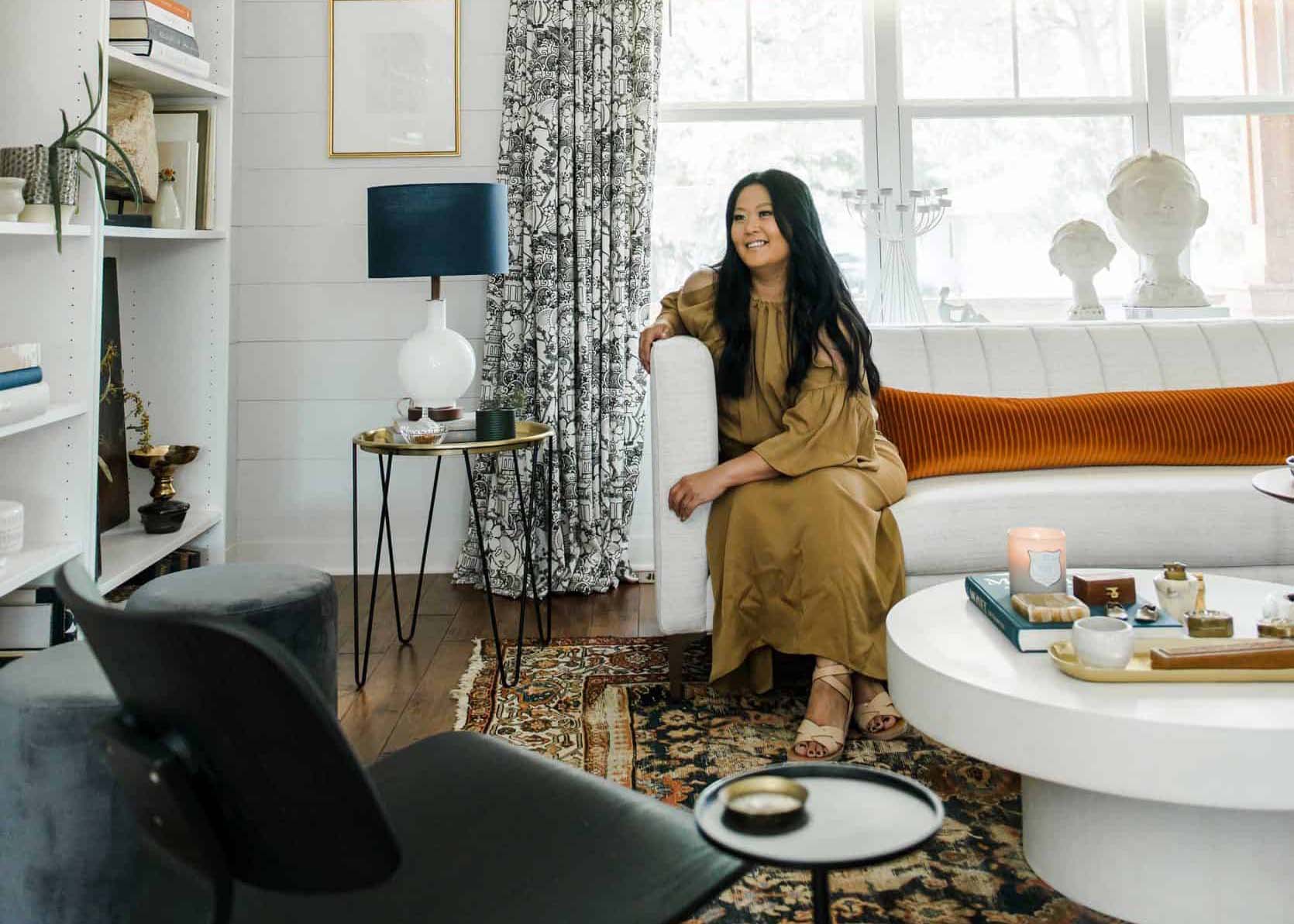

Hey friends, Lea here! I’m so excited to be here and thank you all for welcoming me while I open up and share my home, thoughts and voice. I cannot thank Emily enough for this opportunity!
I’ll begin with a little intro to help get us acquainted again (kind of like speed dating). You may remember my home tour that was published here on the blog a little over a year ago (I can’t believe it’s been that long already!) but I want to fill you in a little more about my home and lifestyle. Like many families today, my husband and I still share our home with our millennial children (one is in their fourth year of college and the other who went straight into the workforce) as well as two cats and a dog. During this pandemic, it’s been a bit of a challenge with two of us working from home now and a third who has online classes. This year has forced me to look at our home in a whole new way and on another level, to say the least. Well… here I am again, facing my design dilemma: our living room. Let me preface this with the fact that our living room has seen many iterations – all of which I have loved (at the time) but after living with my choices they never felt quite right.
When Emily was going through a similar situation with her living room in their L.A home I could completely relate. In fact, her admitting her own challenges helped me face mine. So this time, Emily and I thought it would be fun to tackle my living room together (social distancing of course – I mean she’s in CA and I’m in MN, so we’re fine).
First, let’s take a walk down memory lane so you can witness the evolution and struggle of styling our living room:
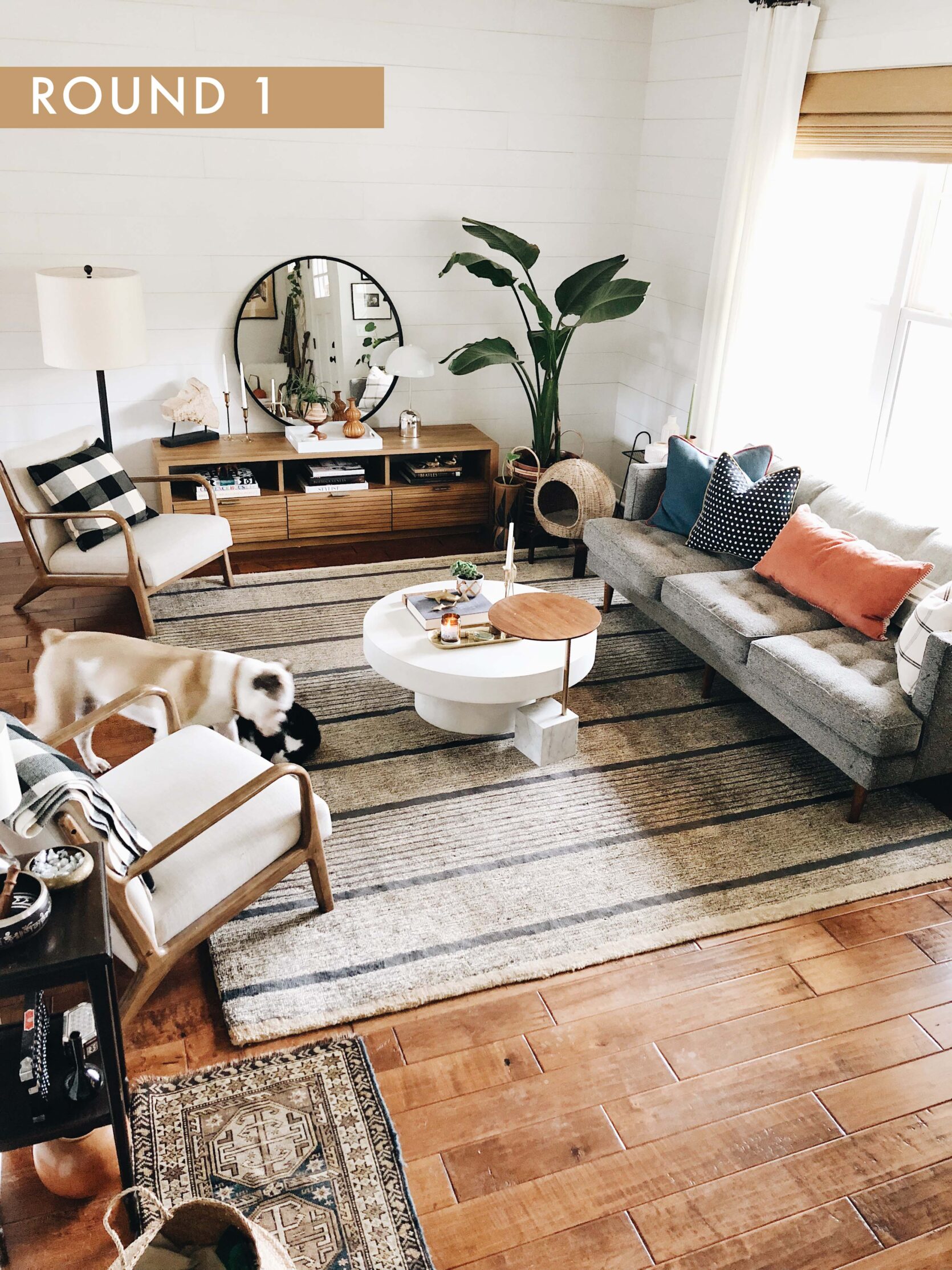
Arm Chairs | Mirror | Credenza
Here is where we started from. That beautiful mid-century style sofa by West Elm (sadly no longer available) was my dream sofa at the time. It also quickly became one of our cat’s dream sofas as well and he shredded that thing like a cheese grater. Note to self: stay clear of a boucle sofa if you have a cat with quick hands. I also loved this rug because it was made of recycled material and if you know me, you know how much I advocate for sustainability but, sadly, it never recovered after an unfortunate cat puke incident.
After living with this space for about two years I was ready for a change and wanted something more sophisticated, besides we needed a new sofa and rug so that was a good enough excuse for me to re-design this space. This is the version you have seen on Emily’s blog before and when I reference back at comments, I think it was favored by the majority.
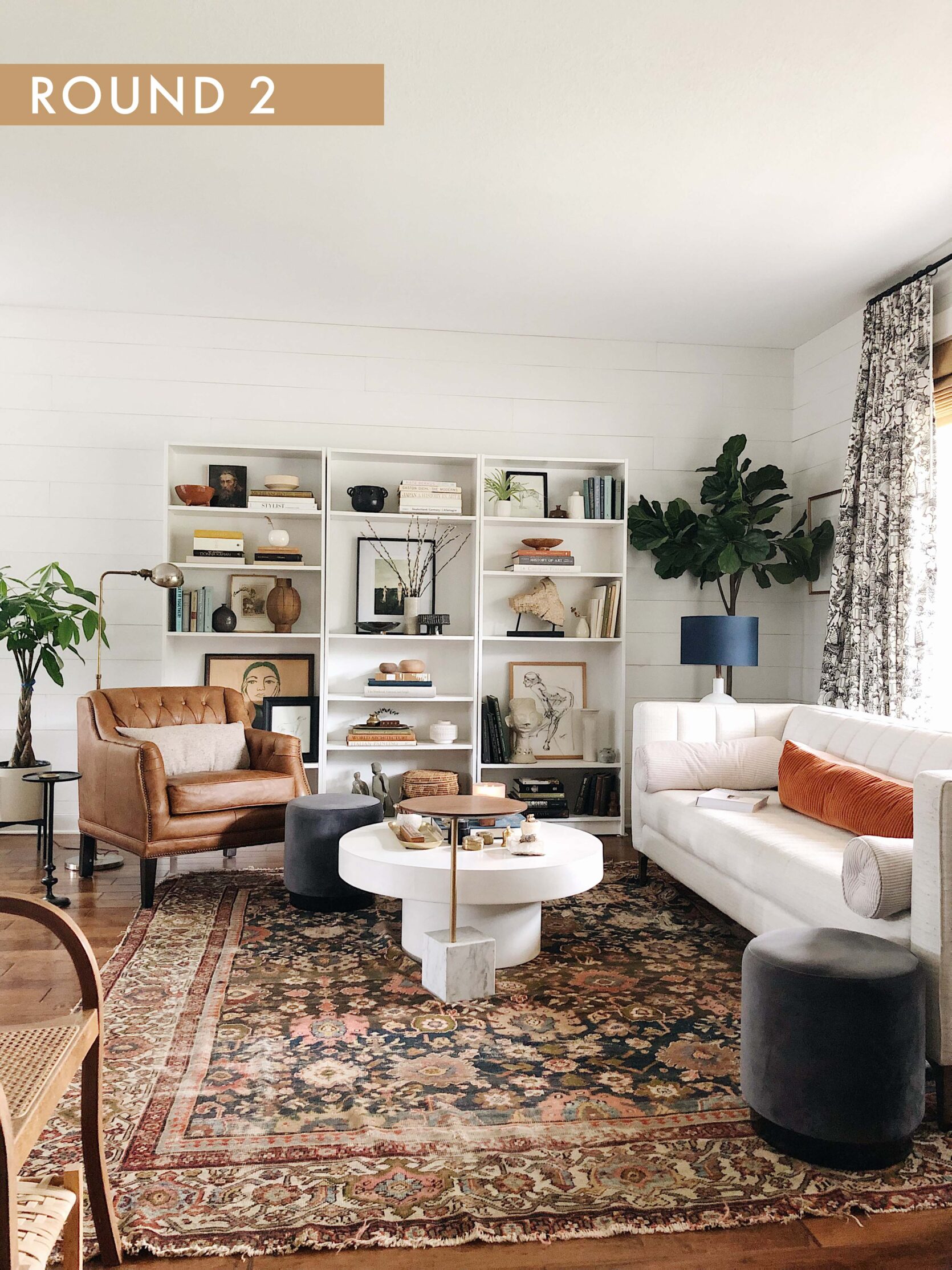
Sofa | Table Lamp | Bookshelves | Fig Tree | Rug | Coffee Table (similar)
I have to admit looking back, I still have so many favorite parts of this design, namely the rug. I love an antique rug and this one is gorgeous. Where did it go? I still have it, it’s stored away for another day because I’m afraid one of our cats will pee on it. However, a bonus is it was very forgiving to cat puke.
Let cat puke dry, pick up what you can and then sort of comb/brush out the rest and vacuum. That and a little mixture of Woolite always did the trick for us.
Then, it’s like the sky opened up and the stars parted by chance because I just so happened to take a trip to Emily’s Mountain House last year and fell head over heels. So naturally, when I came back home, I did what anyone would have done. It was time for another living room makeover!
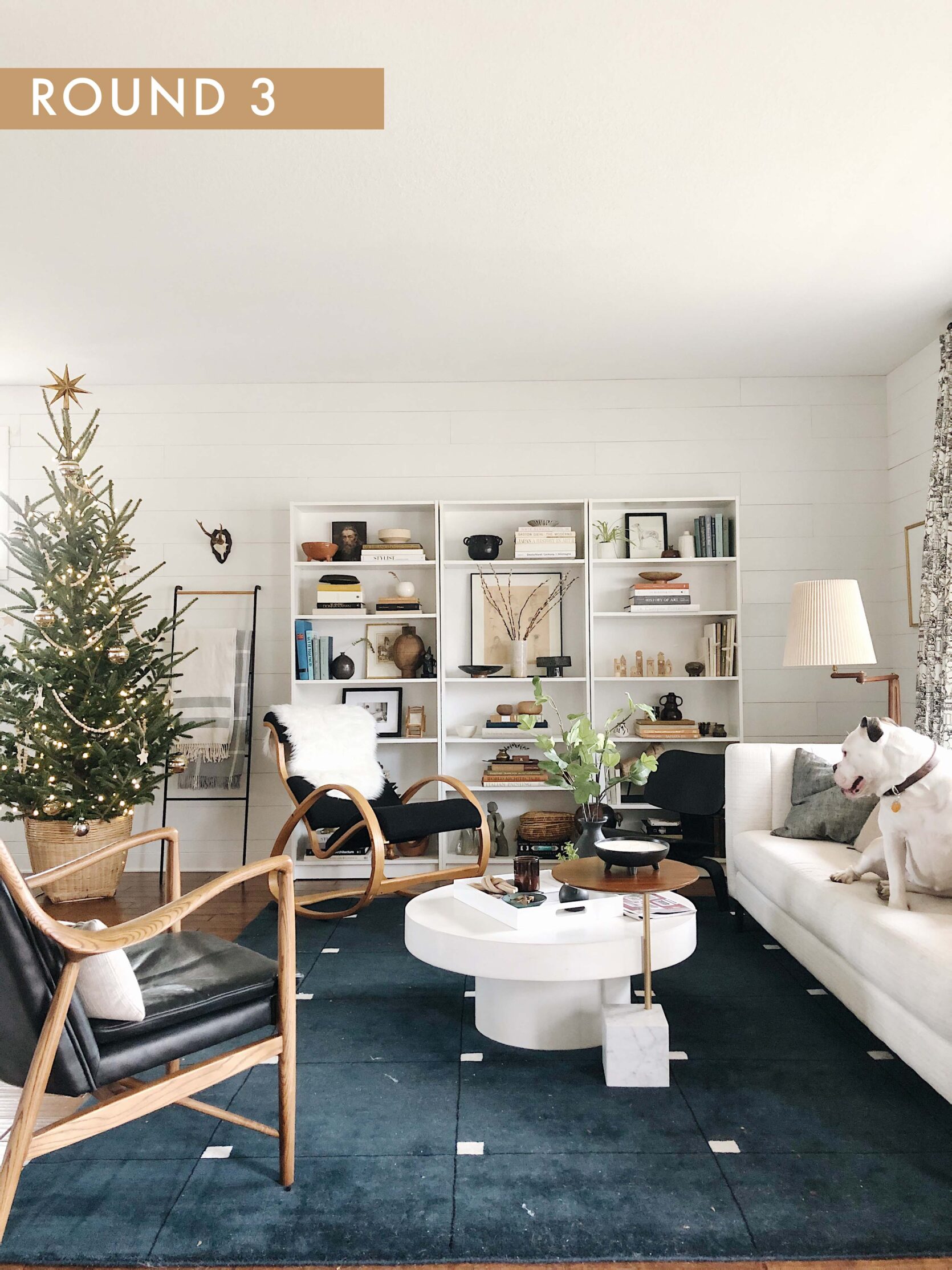
Sofa | Table Lamp | Bookshelves | Fig Tree | Rug | Coffee Table (similar)
The Holidays rolled around and I wanted to incorporate a Scandinavian feel in our home similar to that of the mountain house. I craved more simplicity and I had to have the same rug as Em (it is that gorgeous). The only problem is it is not the most pet friendly. See that love nugget on the sofa? Yeah, white dog fur and dark blue rugs are not BFFs. This quickly turned into a very high maintenance situation where vacuuming became an everyday necessity. Also, our front door opens immediately to this space and well, first impressions are important, right? I want to appear somewhat civilized if someone comes for a visit. I may be having dog fur anxiety as I write this right now.
Alright, now that you’ve seen the current state (as well as the before and the “before before”) here is my very basic floorplan so you can envision the layout we are working with. It’s about as professional as a stick figure drawing of Hangman but you get the gist.
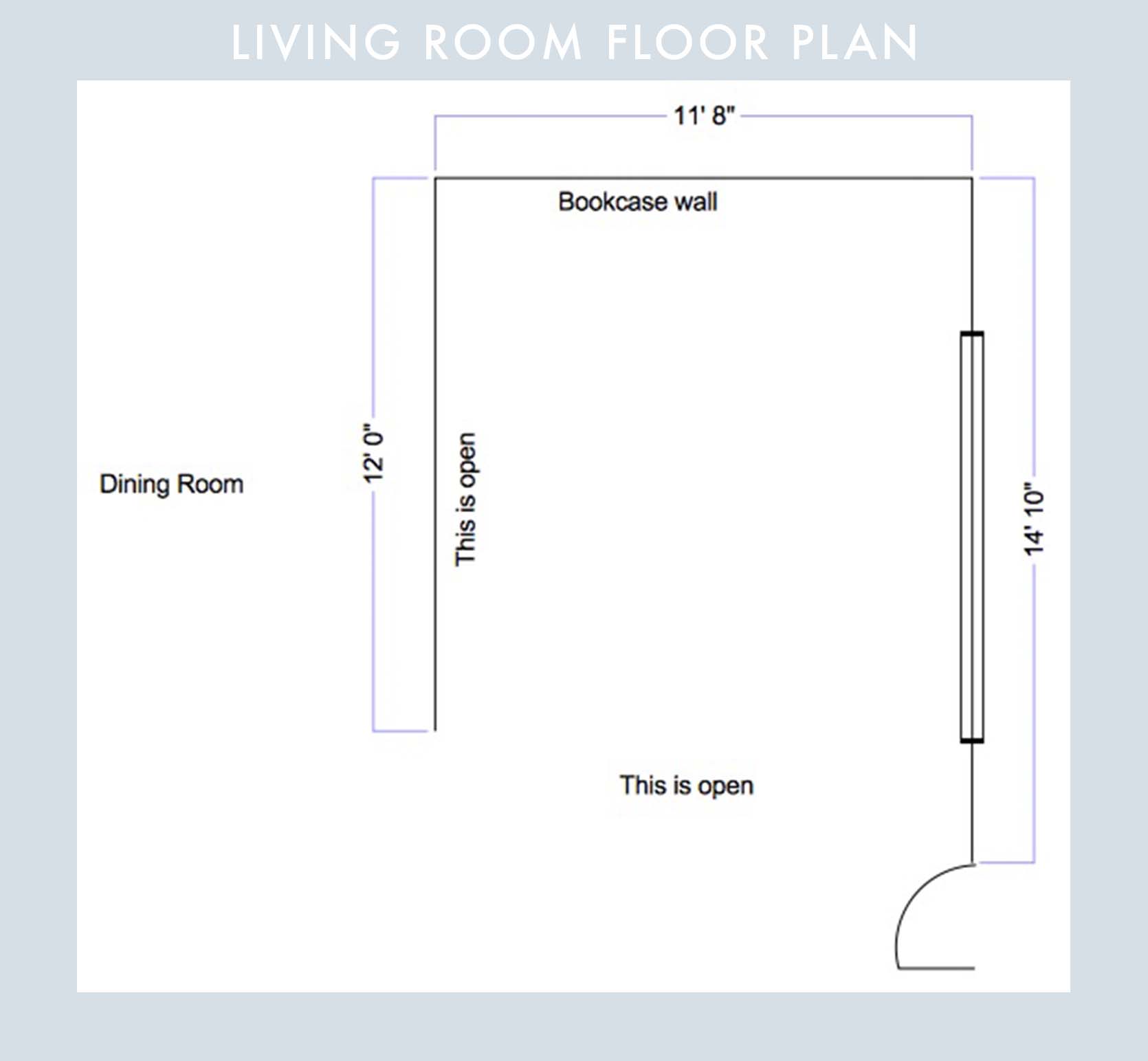
THE CHALLENGES
Not Enough Natural Light
My first question for Emily was, how do I create more light? Even with a west-facing window it still feels dark in here when you are looking from the kitchen and dining room into the living room.
From Emily: “This is such a struggle. I have some bad news for you – it’s truly hard to ‘add natural light’ to a darker room. The overhang on your front patio is blocking it from coming into your window too much, and so what can you really do? There are some tricks of course, that we wrote about here (mirrors, reflective surfaces, etc.) but I think the best thing you could do ‘add life’, not light. You want to pull your eye over towards a darker color to ground the room. I know that your new sofa is white and with white furniture on a white wall, your eye has no real draw over there – there isn’t enough contrast to make that room ‘pop’. What if you did curtains that contrasted against the wall? I’m not saying you have to have a crazy pattern or even saturated or dark color, but just something that pulls you over there, visually (a medium tone could work, or a subtle pattern). Same with the pillows. Get a darker or patterned throw and put it over the sofa and see how much it changes the room and if it pulls your eye over there more. Maybe a good new mantra is ‘when you can’t add light, add life’.”
She gave it to me real folks. But, she gave me some really good suggestions like adding reflective surfaces and thus ‘adding more life’ to the space. Now onto my next issue…
Our pets rule the roost (and thus the space must be pet-friendly)
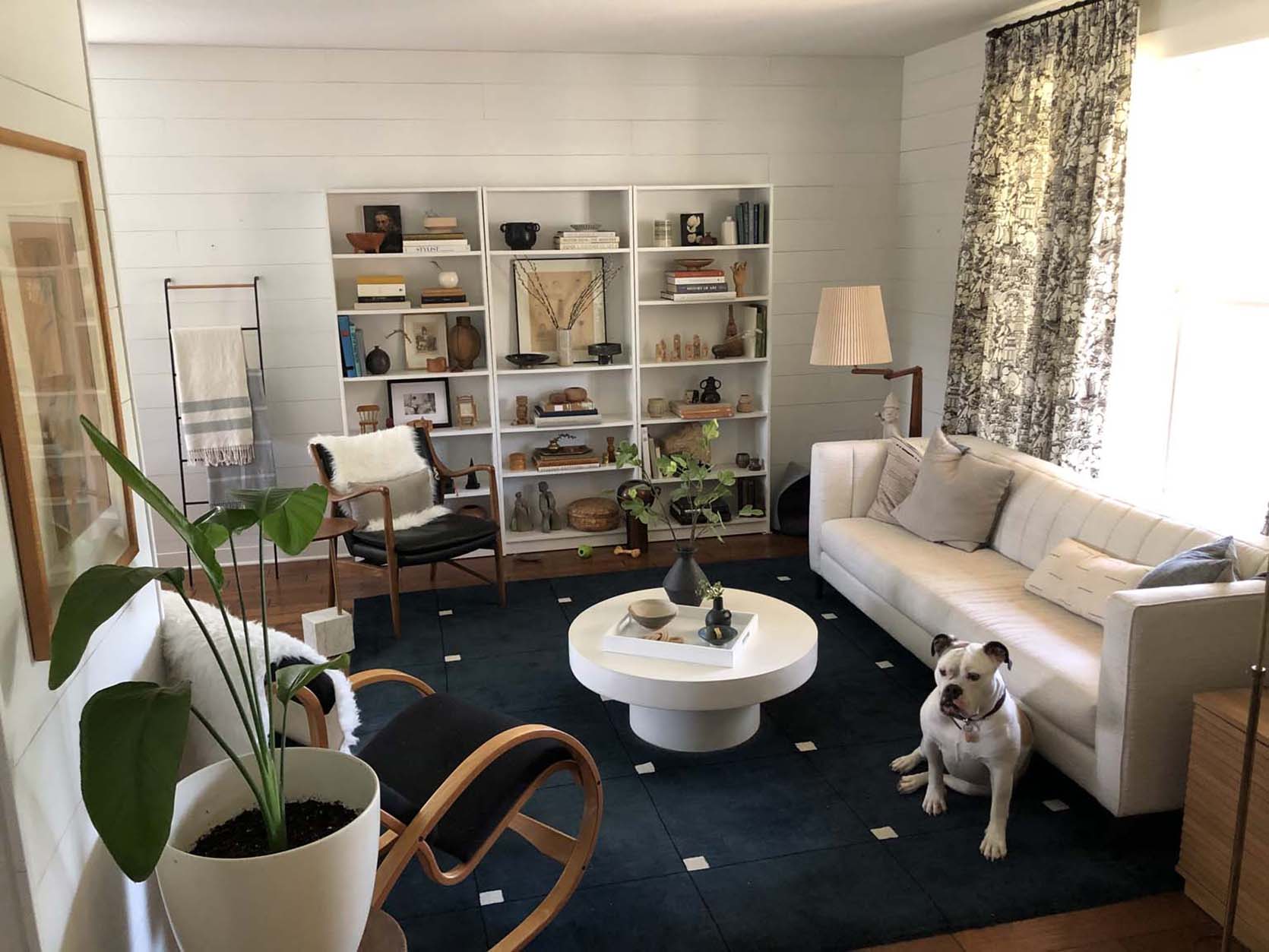
Now that Emily has two dogs I think she may be feeling my pain a bit. My very short hair dog sheds like a you know what, especially when she blows a coat and since we live in 4 seasons, it’s a constant hassle.
The main issues here are the rug and the sofa. While the size of the rug for this space works per Emily, we’re going to table this one a bit and research some rugs that may be a better solution and taking into account that this is a high traffic room.
From Emily: “I think you need a more inviting living room sofa. That one seems like it’s on the smaller and more formal side, making it less conversational and less of a hangout space. I’m a huge advocate of trying to figure out how to make every room as usable as possible and giving every room a solid purpose. A larger more inviting sofa with a chaise I think can give that room more of a purpose- it says, ‘come on over and relax and hang’”.
As far as making the space even more pet friendly, she suggested I read this post, which has tons of awesome pet-friendly recs from you guys :).
The open concept doesn’t feel cohesive
Here’s what I struggle with in my home. I love textiles as much as the next person but I also don’t aspire to have a million and one throw pillows, so I lean more minimal in this category. After some self-reflection, I realized it’s because I don’t know how to pillow talk. What I mean is, I don’t feel confident in selecting pillows, rugs and window coverings that all flow together and look collected vs. independent selections without consideration of their counterparts. Guess what? Emily knows how to do this well and together we’ll work through the sourcing and selection process while I also learn the How To’s.
From Emily: “Since you’ve been reading the blog for a long time you’ve heard me write about color palette cohesion so many times  But yes, having a cohesive color palette will unite the rooms. It seems to me that you have this down already! But listen, pass-through spaces are HARD to design, and yours looks VERY good, so don’t be hard on yourself. You have such awesome stuff so I would first make it as functional, purposeful, and practical as possible – give yourself the challenge of how to make this whole floor the most usable space ever with your major pieces. THEN layer it with your awesome stuff. Yes, this is coming from me, another stylist who used to value style over practicality but I don’t anymore and I think maybe what you are struggling with is how to use the space more than how to decorate the space.”
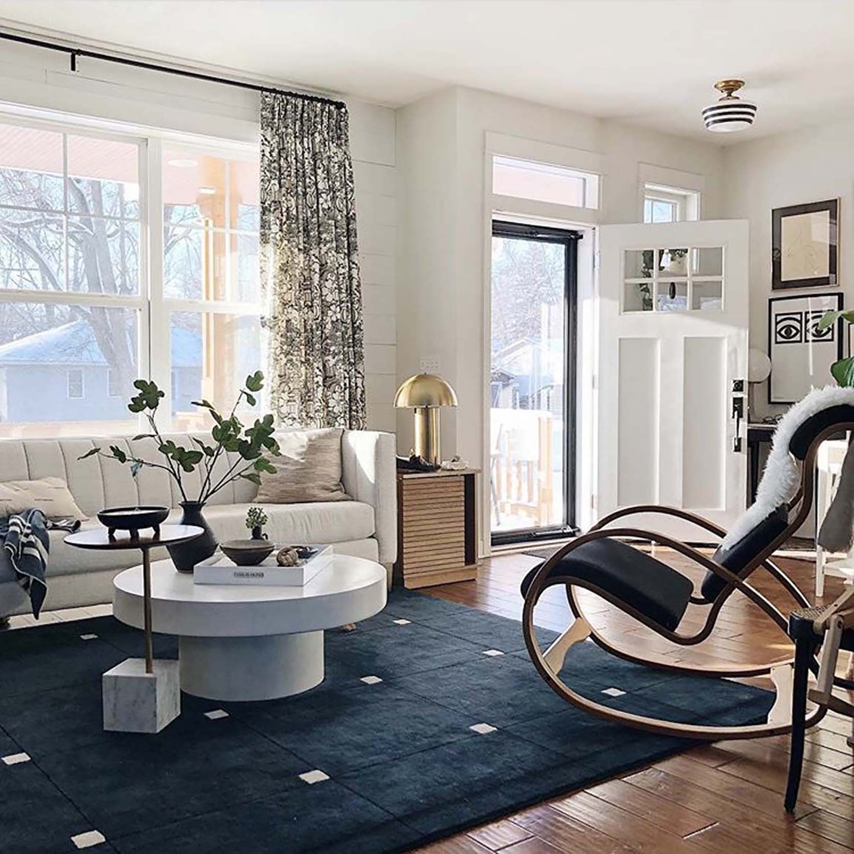
I’m sure I’m not alone here when it comes to “problem areas” when designing a home. If you have one or two that would have been under your microscope, I’m here to let you know we all have them. Now, if you have any tips, ideas, or tricks for me and my living room, please chime in in the comments and I’ll be sure to check back soon with some progress and updates!
Opener Image Credit: Photo by Jennifer Kamrath/Sage Imagery | From: Tour a Stylist’s Mid-Century-Meets-Traditional “Farmhouse” Full of Thrifted Treasures
The post Struggles of A Stylist: Emily Helps Stylist Lea Johnson With Her Open Concept Living And Dining Room Design Agony appeared first on Emily Henderson.
via Emily Henderson https://stylebyemilyhenderson.com/blog/open-concept-design-agony