Jan 2025 Starts Strong with These New FuseBase Features
- 5 Min read
Public (or shared) notes form an integral part of Nimbus Note. You can use them to share your information with any other person, even if he does not have an account with us.
We are happy to inform you that we seriously redesigned and optimized public links for notes. But let’s take it one step at a time.

Optimized performance
Before we used to get complaints about pages with public links taking forever to open. We refused to put up with that and reworked the page CMS. Now pages open virtually instantly even when opened for the first time.
Design uplift
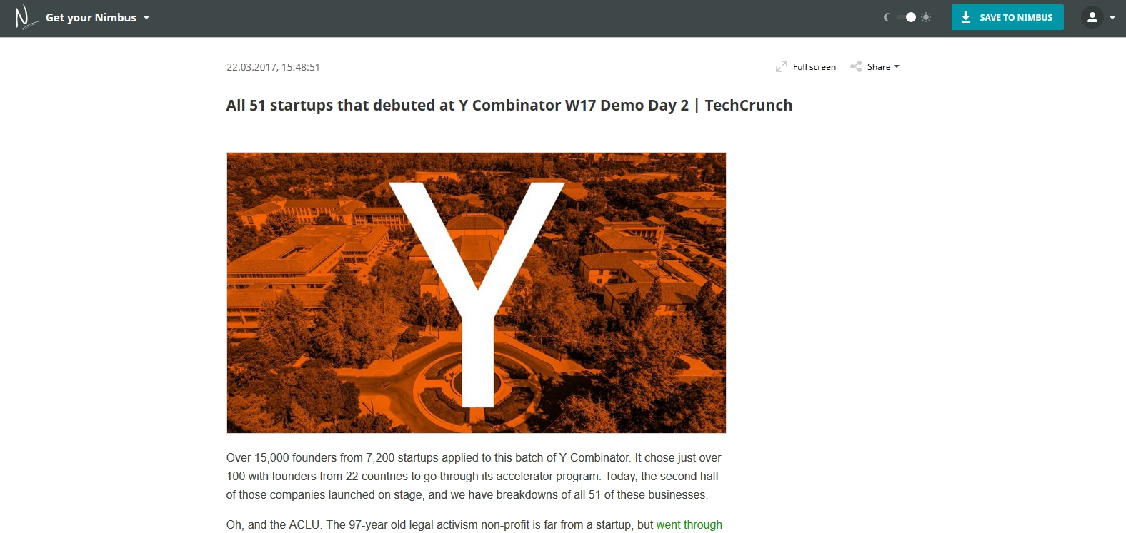
In the old design version there were too many unnecessary elements, while the frame around the note could be quite distracting. We got rid of all that was unnecessary leaving only the most essential stuff, so now the actual page contains nothing more than… just the very note. To make the reading more convenient, we rethought the full screen note appearance and added a button to quickly go back to the top of the note (for long ones).
Night theme
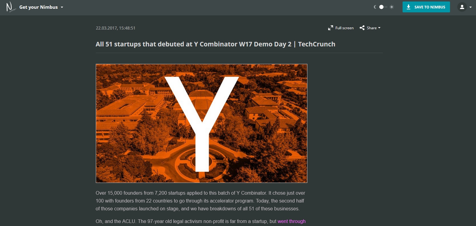
We want to take care of our users’ eyesight and came up with a special night theme. When you switch to it, the background becomes dark and the letters – light, which is perfect for reading when it gets dark.

The appearance of public folders also changed. You can choose between list and tiles.
We’d also like to remind you that the public note and folder design is adaptive: you can read notes on your mobile devices with the same level of convenience as if you were on your computer.
Public link example – https://nimbusweb.me/share/1066471/2dr0a4xzd0176seypsaf
Found it useful? Share the article with your community
Get weekly tips and insights on how to grow your business