What’s New: Explore October 2024 FuseBase Updates
- 5 Min read
A new version of Nimbus Note for iPhone has been released. The app has a refreshed design and a number of new features. But let’s not run ahead and look at them one by one.
Download Nimbus Note for iPhone – https://itunes.apple.com/us/app/nimbus-note-notes-to-do-lists/id828918459?mt=8
New start screen
We got rid of the bottom bar and moved all items to the left menu, also known as the top button. From there you can go to folders, tags, settings etc. This new arrangement allowed freeing up more useful space for notes/folders/tags while also facilitating navigation between various app sections.
New note list
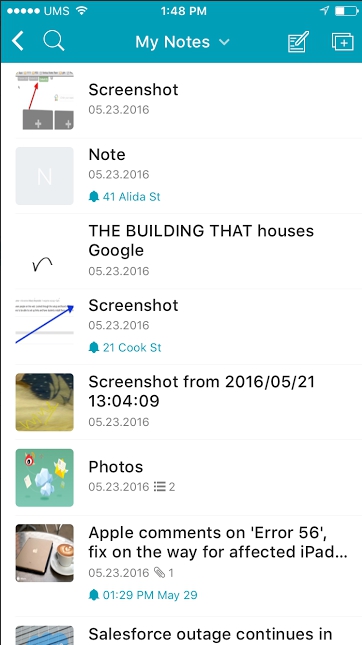
We decided to rearrange the elements on the list. Firstly, we thought we’d offer the user a chance to choose the way the note list appears. For some, just the note titles suffice, while others need the title, the description and a larger preview. Please pay attention to the Cards arrangement that will make any true aesthete happy. It’s also important to point out that date and time for reminders are now displayed on a separate line, which will keep you from forgetting about an important event.

Active thumbnails on the note list
Don’t miss that one – thumbnails for reminders, embedded files and to-do tasks are now active. You can tap on the to-do thumbnail on the note card and a to-do list will open immediately. That’s fast and convenient access without having to open the note itself.
New note viewing screen
In the new version the display screen received a cleaner look and became more convenient. The task panel is definitely an important part of a note, but it’s not always needed, so we decided to move tasks into a separate button freeing up useful space for note contents. We also changed the way the note title is viewed. Now to see the full title, you need to tap on the title and it will open in a special window where you can quickly edit it. This is particularly convenient for notes with long titles.
Improved performance of the editor
We fixed most of the problems present in previous app versions: letters crossing over the edge, incorrectly inserted images and so on. Reading and editing notes has become much more convenient. We have also added a gallery where you can view images contained in a note.
Creating and saving notes with a swipe
Right swipe on the note list – create a note. Left swipe in the editor – save the note. Quick and convenient – isn’t it? We are confident all users will come to love this one.
Recording audio in a note
Now you can record audio without leaving the editor. So handy for students, journalists and so on. Just press to create a new audio note and write text without turning the mic off.
Updated Places screen
No more need to search for locations in order to view specific notes. On a special side panel you will be able to view a list of all locations for which notes were created and go right to them.
But that’s not all. Soon there will be another update that will offer a lot of new features we’ve been asked for.
Found it useful? Share the article with your community